Designing Down the Ballot

Image Credit: Jason Finn
Daniel Ford started out in real estate after graduating from Grove City College in Pennsylvania with a degree in communications, design and entrepreneurship. But through a connection, he landed a gig at Winning Republican Strategies (WRS) as a late-cycle design hire in July 2022.
He’s now the mail shop’s sole in-house graphic designer, working on campaigns across the country.
C&E: With the growing Republican presidential field, there’s a lot of branding for down-ballot campaigns to potentially follow. Are clients coming to you and asking for, say, Sen. Tim Scott’s aesthetic?
Ford: There are some clients whose idea for their campaign and their branding that aligns with some of the newer designs that we’re getting for [presidential candidates]. It’s obviously very helpful if they communicate that upfront. But most of the time, and often for a smaller race, that won’t even factor in. They won’t bother to mention it. I think it depends on where they are in the country. If the presidential branding is in a similar region to them, they’re way more likely to be like, ‘We want that.’
C&E: In the cases where clients do want to align themselves with a presidential candidate’s branding, is there one standout?
Ford: We’re seeing a lot of people who want to align with Trump’s branding or something similar. We’re also seeing a lot of people who want to change it up, because political design has been so similar for so long. They want a more modern design, more modern colors, more modern presentation in general to get away from either the look of having a small, local campaign when they’re trying to achieve something bigger, or just to get away from the look of being dated.
C&E: Where are you getting your inspiration from for the clients who want to change it up?
Ford: I would say most of my inspiration comes from outside the political sphere just because I don’t want it to look like it was created just for this purpose, just to get you to vote.
I’ll start with a branding idea, or a few branding ideas and whatever the client approves, I’ll start searching for any design that sort of matches the same vibe and then take inspiration from that.
C&E: You do a lot of design for print, what fonts are clients gravitating to in 2023?
Ford: We’re using a lot of sans serif, a lot of heavy weighted typefaces. It matches a modern vibe that we’re going for with a lot of our brands. But then, in some cases, if someone’s running for, like, district attorney or something, that’s seen a little bit less modern and more academic, we’ll definitely switch it up and go with an arial font, something a little classier.
C&E: Are you noticing any regional trends in terms of design?
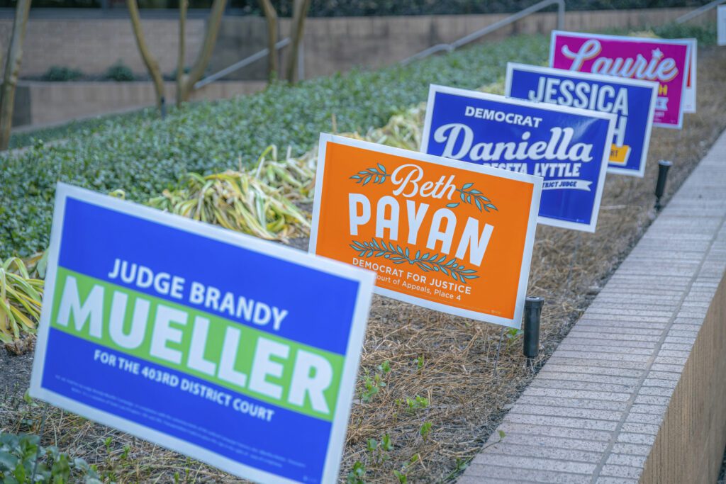
Ford: I haven’t observed that in terms of typefaces or fonts, but certainly with colors. Even within our work in Virginia, the colors that we choose will have to be dependent on the district. If it’s a very Republican district, then we have to go with red. But if it’s a little more flexible then we have the freedom to be expressive with the colors that we choose for the brand. So for a candidate that we’re doing now, we’re using saffron and orange, which is something that doesn’t always pop up. I’m seeing a lot of blacks and greens — mostly for Democrats.
But if you’re not sticking with red, white, and blue, then your yard signs fade faster. There’s all sorts of things that you have to consider when you’re trying to execute on what looks good on a computer screen [and in real life.]
C&E: Are you guys still doing yard signs as part of the initial branding package for clients? Or is that something folks have to specifically request?
Ford: That’s part of the package that we deliver to every client. We’re using purple for some clients, we’re using green for some clients. You can definitely be flexible. You just have to stay with the bright colors and stay away from the more pastel tones, which would work well in handouts and stuff like that.
C&E: At this point, are clients coming to you with existing branding in place, or do you need to start from scratch?
Ford: I’d say the majority is from scratch, but it’s probably a 60-40 split. A lot of people are just unhappy with the agency they were with previously, or they have brands from other campaigns or something that they tried to run [on]. So sometimes they’ll come to us with a set branding package and we will have to work within that. And sometimes we get to start from scratch. It just depends.
We get two pieces of information from what they’ve done previously. One is sort of what the client will approve and what they’re looking for in the design. And two, what didn’t work.


