The Creative Safety of New Jersey and Virginia

Political campaigns have shown more willingness to experiment with their logos and branding over the past couple of cycles, varying color schemes and playing with different type faces.
It’s something that’s excited some political design pros who’ve been pushing campaigns to be a bit bolder. And it’s a trend that Susan Merriam, a designer and the co-founder of the Center for American Politics and Design (CAPD), said she expects to see more of next year, especially for first-time candidates or upstart hopefuls in primaries.
But, noted Merriam, look no further than the top of the ballot in Virginia and New Jersey this year to see why most mainstream party nominees are less likely to break out of the traditional design box anytime soon.
“Both the New Jersey and Virginia [gubernatorial] races fit into the more traditional visuals in political communication,” said Merriam. “They’re not pushing the envelope. They’re very safe.”
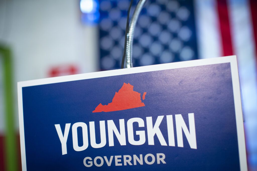
In Virginia, for instance, Glenn Youngkin went with the traditional red, white and blue for his branding and Terry McAuliffe went with a color scheme that’s emerged as the Democratic equivalent: “If you’re trying to not use red and blue, but still come across as a moderate Democrat, blue and green is usually the next most popular color combo for Democrats,” said Merriam.
To wit, New Jersey Gov. Phil Murphy made the same color selection with his logo while Republican Jack Ciattarelli went red, white and blue with his.
“You’re going to continue to see people willing to push the envelope, particularly in primaries,” Merriam said, looking ahead to next year. “But in the general election, particularly in competitive races, you’ll probably continue to see safe choices like you see in New Jersey and Virginia.”


