The Importance of Logo Versatility and Why Instagram Beats Twitter
After graduating from the University of Alabama in 2016, Hannah MacInnis thought her future was going to be in public relations. But the skills she picked up from a memorable graphic design class helped her land a creative job at the RNC instead.
That opened the door to a role on President Trump’s inaugural committee where she handled the Twitter account and the design of all things paper. From there, she went to the White House, where she worked for two and a half years running various admin social media accounts. Her final job in the Trump administration: digital director for Vice President Pence, whom she continues to work for through his Advancing American Freedom group while operating her creative consulting shop.
C&E: How much creative energy do you think campaigns and groups should channel toward Twitter in 2022?
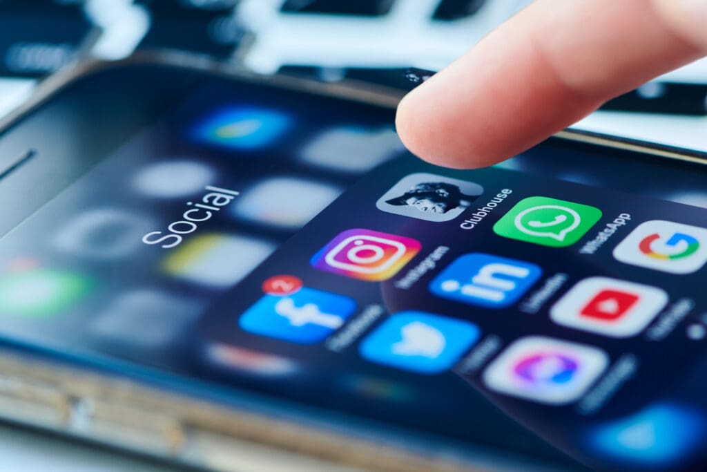
MacInnis: I think there’s a gravitation towards Twitter because for so long it has been the source to get information to the American people. But we’re seeing the world move slowly off of Twitter. Outside the Beltway, people are on Facebook, Instagram. If you’re trying to get more eyes on your content, you have to be on a place like Instagram. You can put up graphics, you can put up videos, you can link to outside things. It’s a combination of a lot of different platforms in one. TikTok, I’m still not sold on.
C&E: How did your work in the White House shape you creatively?
MacInnis: I was very young when I was there, which was actually a great thing because I was able to shape my personal style as well. I learned what is worth spending time on, what is not and how fast we can get things out. If something major is happening, do we take an extra 30 minutes to create a graphic or do we get it out? When you’re dealing with different clients whether it’s organizations, a politician, the White House, it’s going to be different every time, and your advice to them on that best practice would be different for everyone.
The president had a large creative team for design, for social, and we fell under the comms umbrella. On the vice president’s team, it was just me. I was grateful to have that experience because it helped me gauge how much work [something] is for one person.
C&E: Where do you get your inspiration from?
MacInnis: I spend a lot of time on Instagram. There’s a website called Dribble I check that’s a collection of designers and everyone puts their designs for people to look at. If I’m in the airport and I see something, I’ll snap a photo of it. My phone is filled with random ads from stores.
The Senate GOP, I’m constantly looking at their graphics. They do a great job balancing an old and new style. You’re always going to draw inspiration from your own people, but there are so many fresh ideas everywhere, so I look at the other side of the aisle too for inspiration.
C&E: What political design trends do you think we’ll see in 2022?
MacInnis: We were very minimal and simple for a long time. I can see it getting back to interesting script fonts where before it’s been very basic sans serif fonts — and people playing with more color. I also think now we’re serving more to people on their phones, so we’re having to adjust to how people are taking in our content. On the right, conservatives are going to stick with the red, white and blue because that’s a source of comfort for them. But I think we’ll see more shades of blue and more shades of red.
C&E: What’s a common design mistake you see campaigns or groups making?
MacInnis: I think that people don’t give themselves enough versatility in a logo. A common mistake is that they don’t think about the smaller parts of it — what part of it can you take out to put on a hat or a cup? I think it’s important to have those two parts.