Why Good Design Is Even More Meaningful Down-Ballot
A conversation with designer Raymie Humbert on the branding mistakes candidates often make and the importance of accessible design.

Image credit: Raymie.xyz
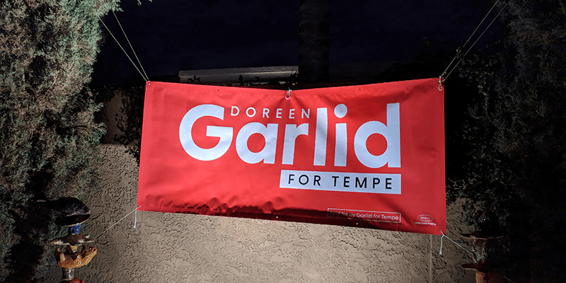
Arizona-based creative Raymie Humbert was designing primarily for esports events before getting involved with local campaigns. But after working on city council races in Tempe for several years, he’s realized the considerable overlap between promoting Super Smash Bros. tournaments and getting candidates elected to public office.
You’ve got to break through the clutter, get people to register (to vote or livestream) and then participate (cast their ballot or tune in). In both cases, there’s a discerning audience that’s craving authentic design.
In a conversation with C&E, Humbert talked about the differences in designing for print versus online and what design mistakes stand out for him:
C&E: What’s the difference between designing for mail and designing for social media?
Humbert: With mail pieces, you need an information hierarchy. I’ve always been a connoisseur of information design. You want to be selective, but you also want it to be on tone with everything else. You have to hit the call to action — it’s “vote for this candidate and here’s how.” But most of the content is the why; it’s making the case.
With social media, the main thing is sizing. You want to have the appropriate sizes that are native to the platform and that show up well, but not only should it look native to the platform, it has to match your campaign. You also want it to not feel like it’s coming from high above. If you are going to work on any social media project that involves Gen Z or Millennials, you have to be authentic as possible — these people grew up with the ability to detect bad brand BS. It’s like they have X-ray eyes: They’ll see through everything you put out that’s overly corporate or doesn’t engage them at all in a meaningful way.
C&E: What mistakes do you see candidates making when it comes to design?
Humbert: There’s so much clutter out there. When you’re running for [down-ballot] office, you need to remember that you’re not a Senate campaign, you’re not running for governor. You’re running in a more local area — obviously, you have fewer resources, but good design can help you stand out when it comes to mailers and materials. Good design, subconsciously, gives people more trust in you. It’s a judgment on your campaign and, ultimately, the candidate when you get down to it.
Color and type are the most important aspects. You need to convey competency. I see a lot of candidates, I think it’s more on the Republican side, where design of signage or any assets is really an afterthought: it’s pretty spartan, it’s a system or default typeface, there’s not a lot of thought or care put into it. Good design says to a voter: “This campaign is thought out. The person that is running will be competent and thoughtful and professional.”
C&E: What does good political design mean to you?
Humbert: It has to match the candidate in some way. It can’t be discordant with the local context or a mismatch to the candidate, and that can happen in several ways. Good design is also accessible design. There’s thought put into it and into how it meets the needs of everyone.
C&E: How do you make design accessible?
Humbert: One way is by using the Web Content Accessibility Guidelines, which are a specification published by the World Wide Web Consortium (W3C). They basically explain how web content should be made more accessible to people with disabilities — mostly, for a campaign, the important part is the contrast guidelines for text. You should ask, ‘What are the color combinations that are going to be accessible for people who consume our digital materials?’ For instance, if you use white text on a light blue background, that might not be accessible. The work of Raquel Breternitz on the [Elizabeth] Warren campaign was really kind of standard-setting. It’s unfortunate that we associate accessibility with Democrats, because it’s important that campaigns be open to all people. Good design is for everyone.


